


NEW LOOK, SAME COMMITMENT.
We’ve refreshed our brand with a new logo design to better reflect who we are, where we’re going, and how we support the partners and businesses who grow with us.
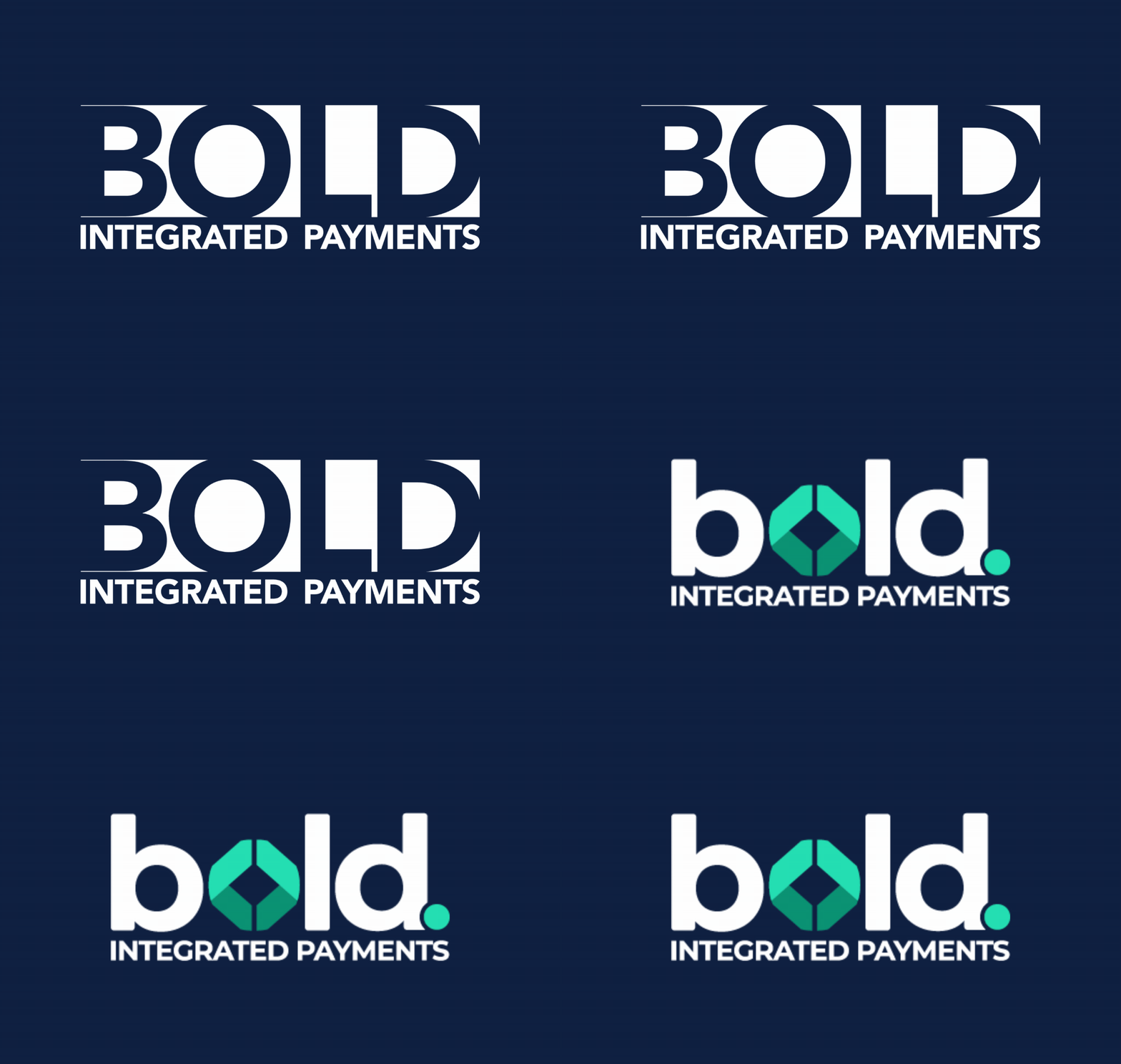
Same Team. Same Service. Bolder Identity.
A More Modern Identity
Our updated look reflects a forward-thinking company built for today’s payments landscape.
A Clearer Message
We refined how we talk about Bold so our partners, clients, and team can better understand what we stand for.
Foundation for Growth
This new look gives us room to grow while staying rooted in the service and relationships that got us here.

THE INSPIRATION BEHIND OUR NEW LOOK
This new design gives us a stronger foundation for future growth, innovation, partnerships, and the next chapter of Bold.
The bracket-inspired elements in the new Bold identity are a nod to coding syntax, specifically the use of brackets and tags in development to define, structure, and emphasize content. In many ways, they symbolize what Bold Integrated Payments aims to do: create clarity, connection, and strong foundations behind the scenes.
Just as code uses structure to bring ideas to life, Bold powers the technology and integrations that help businesses operate, connect, and grow with confidence.
What has not changed
While our appearance has evolved, the foundation of our company is consistent. Bold remains focused on supporting our partners, serving businesses, and creating payment experiences built on trust, responsiveness, and reliability.
The Why Behind the What
As Bold Integrated Payments has continued to grow, we recognized that our brand needed to evolve alongside us. Over time, our business, partnerships, and long-term vision have expanded, and we wanted an identity that better reflects who we are today and where we’re headed next.
This new design was not about changing our values or starting over. It was about creating a more modern, confident, and recognizable brand that aligns with the level of service, innovation, and partnership we strive to deliver every day.
We updated our look to create a stronger visual identity, clearer messaging, and a more consistent experience across every touchpoint. From our logo and colors to the way we communicate, every change was made intentionally to better represent the momentum of our company and the future we’re building.
While our appearance has evolved, our commitment remains the same: supporting our partners, serving businesses with integrity, and continuing to grow with purpose.
SAME FOUNDATION
We’re still committed to the partnerships, service, responsiveness, and reliability that have shaped who we are from the beginning.
Our team, our values, and our focus on supporting businesses continue to be at the core of everything we do.
BOLDER FUTURE
As technology, payments, and partnerships continue to evolve, we’re building a brand designed for growth, innovation, and the future of connected commerce.
This refresh represents confidence in the future we’re creating together.